I really enjoyed trying out the Google charts and maps apps.
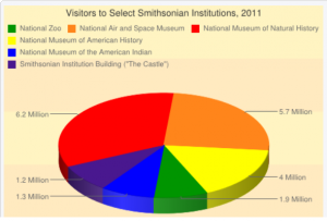
I created the pie chart below using information from the Smithsonian Newsdesk’s “Visitor Statistics” page. The chart app was a little difficult to use at some points; it didn’t allow me to enter some data sets right away, and it kept changing the colors that I had selected. One big caveat: I thought I understood how to embed the chart in my blog (using the HTML format), but despite my best efforts, I wasn’t able to get it to work. (I apologize if the quality of my chart isn’t great–I had to use a screen shot instead).
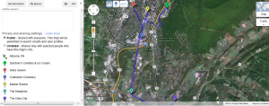
The interactive tutorial made using Google Maps easier than the chart app, but I still struggled with drawing clean lines (and again, with embedding the map–I’m sorry for the screen shot). I mapped a few of my favorite ice cream places in my hometown (Altoona, PA). I’m excited to become more familiar with both of these tools!


