I had no trouble embedding my chart this time, which was exciting! Professor Cohen showed me that the hyperlink generated by the app is missing the “http:” when I create a chart, which I hadn’t realized the first time; knowing that this time around allowed me to insert it relatively easily. Creating the chart was easier than the first time, too, though there were still some features that I found a little hard to use (like getting the y-axis to contain the range of numbers I wanted; it had to be changed not only in the “Axes: Range” subheading, but also under the scales for each data set).
I chose to make a chart using information from Probing the Past, a collection of probate records from the mid-1700s to early 1800s from estates in Maryland and Virginia. At first it was hard to decide what information to compare; there’s a wealth of material available. I ended up browsing by time period and clicking on decades at random; then I’d skim several reports in a particular decade and move on to the next decade. I decided to try to compare two estates from the same period in the same town, but sometimes there were only two estates in the same area and their owners did not have items of comparable value. When I was browsing through the records from the 1770s, I decided to focus on those from 1776. At the dawn of our nation’s independence, there were many who were still not free; I decided to reflect this information in a chart dealing with the number of slaves owned by a given master.
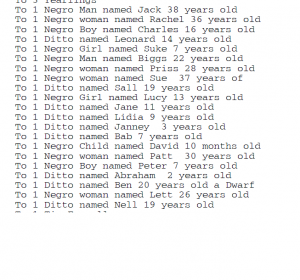
At first I thought I would compare the number of slaves held by two different owners from the same area, but then I found that an interesting comparison could be made simply by looking at the records of one man. An inventory was taken of the possessions of John Fendall Beall of Prince Georges, MD on May 8, 1776, after his passing. On the third page, between listings of his cattle and his silver spoons, was this list:
I would have liked to have included labels for each bar to denote specific ages; for example, the very first entry represents David, a ten-month-old baby, while the last female entry is for Sue, who is 37. I searched for a feature that might allow me to do so under every subheading without any luck. I hope the screenshot above will make the comparison relatively easy.
Seeing the data represented this way raises a number of questions. Of the twenty-one slaves belonging to Beall, 13 were female, and 12* were children (boys and girls) under 18–many of them were younger than 10. (*It is interesting to note that Ben, who is twenty years old, is also listed as a “boy” because he is a dwarf). What kind of land did Beall own? What kind(s) of work did his slaves do? If the vast majority of his workers were women and children, was his farm/plantation/factory as productive that of another owner of the same period who had a greater number of adult male slaves? There are so many children; are they the offspring of his male and female slaves, or did he acquire them separately? Are any of the children Beall’s?
Relating information in a graphic format is very useful for historians; it almost immediately brings to light discrepancies, comparisons, and/or oddities that can provide a great starting point for research.

