The Feltron Reports: Days in the Life of an “Infographic Storyteller”

While perusing  feltron.com, I came across a link to Nicholas Felton’s blog on tumblr.  Thinking it would be interesting to see what he blogs about as I prepared to write my own post, I scrolled through the most recent stories. Interestingly, the last post was from about a month ago; I’d assumed that Felton would be a frequent blogger. I was also somewhat surprised by all of the photographs this man of numbers had posted (though I probably shouldn’t have been because I’d read his Feltron Reports and seen the incredible number of pictures–digital and analog–that he’s taken over the course of a few years).  In the midst of some photographs and re-blogged articles, I saw a video of Felton speaking at the 2012 Eyeo Festival. While I didn’t watch his whole presentation, I did watch a few minutes of “A Man of Few Words* (*But Many Numbers)”.

Felton breaks down the creation of his yearly reports into eight steps in this video, focusing on his most recent work– the 2010 – 2011 Biennial Report (which interestingly focuses on relationships, perhaps after the death of his father in 2010 caused him to pause his work on the project and turn it into a two-year piece). To preface the in-depth description of his methodology, he describes why numbers, “the new elemental material”, are so fascinating: they have “infinite potential”, are “malleable” (they can be moved and associated with other data without changing their intrinsic meaning), and can help one to tell his own life story. Even this brief background gave me a better understanding of why Felton would want to encapsulate his life in numbers–the young graphic designer once struggling to find material used them to transform himself into an “infographic storyteller”.

I ended up looking through all of the Feltron Reports–they’re really interesting, not too long, and very visually appealing. It was interesting to see how Felton’s style evolved over the course of half a decade; the first report, from 2005, contains data supplemented with many photographs, and its design is straightforward and simple. By 2006, he had changed his focus completely, using graphics that were much more complex and a format that was utilized lots of colors, shapes, and numbers. By 2007 – 2008, he was using a variety of graphically reproduced maps, as well. It was also neat to see how the subject matter of each report changed; while in 2007 he focused on collecting data about the many facets of his daily life (music, eating, reading, travel, etc.), his 2009 Report focused on the relationships/encounters he’d had with people (what they’d done, what mood he was in, what they’d talked about), and his 2010 Report (“The Paternal Report”) reflected on his father’s life.

While I really enjoy the design aspect of the Reports, I’m fascinated by the ways in which Felton collects his data–I can’t imagine trying to keep track of all of those statistics for an entire year! The 2010 Report, a legacy to his father, featured material already in his possession, but the 2009 Report (about his relationships) featured data collected from online surveys filled out by everyone with whom Felton had had “meaningful encounters” (if they remembered/chose to respond). Felton is the co-creator of a website that shows people how to collect data of the sort that fills the rest of his reports– daytum.com. I’m impressed by the discipline it would take to remember to track some of the relatively mundane details/data of day-to-day life, though I guess for someone like Felton, it’s become a habit (and maybe even a bit of an obsession). With his novel way of looking at the world, it’s no wonder the Fast Company named Felton one of the 50 most influential designers in America.

 

Google Earth

I had so much fun using Google Earth! It’s an awesome app; I loved being able to “fly” around the world and to zoom in so far that individual houses could be seen (just as they can be when using the satellite feature on Google Maps). I did some “traveling” to my must-see locations, and then returned to my town in Pennsylvania, zooming in far enough to see my own house. It’s pretty neat.

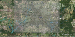
I chose to create a map of Berlin because I’ll be traveling there over winter break; I overlayed a map from the United Kingdom’s National Archives Education Division in its coverage of the Berlin Blockade/Cold War.

Occupied Berlin, 1948 - 1949

The overlay map shows the divisions of Berlin by France, the United Kingdom, the United States, and the Soviet Union after World War II, with this particular map referring specifically to the Berlin Blockade of 1948 – 1949. Berlin’s overall boundaries do not seem to have changed much from the mid-20th Century (black lines) to the present (purple lines), though differences are noticeable in the southwest corner and borders have changed slightly in the northwest corner. Even though there were relatively few major adjustments made to boundaries, matching the historic and present cities’ borders was still a little bit of a challenge and could not be completely accomplished. The hardest part of the exercise was finding a map of Berlin that  I was able to use with the image overlay function; several would not show up–only a red ‘x’ would appear in their place. After finding this image, though, I was able to complete the exercise and became more comfortable with a variety of the layers on the Google Earth toolbar (for clarity’s sake, I didn’t use any of them in this first overlay).

“The Differences Slavery Made: An Analysis [of Digital Scolarship]”

Thomas and Ayers, both of the University of Virginia, offer their work, “The Differences Slavery Made: A Close Analysis of Two Historical Communities“, as a model of building digital scholarship from “the ground up”. Their extensive research, which chronicles and catalogs the political, social,agricultural, industrial, and economic circumstances of a Union town and Confederate town within the same geographic region, presents an excellent case study about the influence of slavery in shaping society.

The authors “attempt to translate the fundamental components of professional scholarship-evidence, engagement with prior scholarship, and a scholarly argument-into forms that take advantage of the possibilities of electronic media.” Their study does so by incorporating four particular qualities. It is:

  1. spatial
  2. participatory
  3. procedural
  4. encyclopedic

I felt as though the authors did construct the site in a way that lent itself to exhibiting these characteristics. Its maps, graphs, and charts were certainly valuable evidence in the research process but could stand alone for separate study. The website engages the reader and makes him an active participant, rather than a passive viewer. Participation is crucial in engaging the “procedural” layout–with its many steps and components–which holds a great volume of material.

Despite its many promising features, the authors also note that their case study has presented areas for future digital historians to improve upon:

  • how to present narrative more effectively
  • how to represent event and change
  • how to analyze language more precisely
  • how to create visualizations as compelling and complete as narrative

I thought the site was impressive, but I think some of these areas need to be addressed, as well. The flow of the narrative seemed somewhat apparent at first–one should just follow the links/tabs in order on the left–but became harder to determine because of the volume of information. Perhaps the tabs above the text are meant to be read first to provide context (“Overview”, “Presentation”, “About the Author”, “Acknowledgements”).  Additional tabs toward the top and bottom of the page–“Evidence”, “Historiography”, and “Tools”– may cause some confusion if the reader is uncertain as to where to start (these are probably not the best choice, because reading the “Summary of Argument” articles first provides context for appreciating these topics later).  It becomes relatively clear that the site is not necessarily configured in any particular order, but rather grouped by concepts–arguments, methodology, points of analysis, etc.–that the reader may browse in the order he chooses. There is not one “best” way to go about perusing the site. While I understand the philosophy of allowing the reader to follow the “procedural” guidelines, which involve sifting through multiple layers, I think the page set-up could be a little more streamlined (as well as more visually engaging–the home page does not draw the reader in).

In terms of other visual questions, the maps and charts available on the site are excellent, but if one does not take the time to ” follow [the] procedures to follow the intricacy below the level of the analysis”, he may miss out on some compelling evidence. Because of this possibility, I think it might be wise to have thumbnail sketches of one or two maps on the introductory page in order to attract the reader’s attention.

With those suggestions in mind, I do think the authors did a great job of making the website “encyclopedic”–it offers a great deal more evidence and documentation than a fixed text could. In addition to a number of maps created using GIS technology, the website also contains full citations, synopses, and excerpts from each of the articles it quotes or references, and when possible, links to full-text versions of those articles. Neither of these practices would be possible when publishing in a standard journal. The website also offers an impressive set of tools–a reader can perform a full-text search, use the “Reading Record” to see which parts of the text he has viewed and which he hasn’t, and enter the citation “key” of a particular piece to be transported there directly.

While there is always room for improvement, I think Thomas and Ayers have created an excellent resource that demonstrates how beneficial technology can be in relaying complex historical data. In so doing, I think they largely achieved their goal: “In fashioning this digital presentation, in putting together components of argument, evidence, and historiography in sequences that are both modular and connected, we hope to have created a useful interpretive model [and have offered it] to the scholarly community as a first step in hopes that we might begin envisioning new forms of scholarship.”


Google Tools

Image

I really enjoyed trying out the Google charts and maps apps.

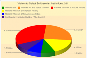
I created the pie chart below using information from the Smithsonian Newsdesk’s “Visitor Statistics” page. The chart app was a little difficult to use at some points; it didn’t allow me to enter some data sets right away, and it kept changing the colors that I had selected. One big caveat: I thought I understood how to embed the chart in my blog (using the HTML format), but despite my best efforts, I wasn’t able to get it to work. (I apologize if the quality of my chart isn’t great–I had to use a screen shot instead).

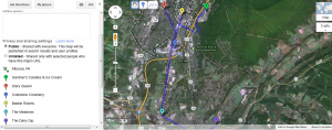
The interactive tutorial made using Google Maps easier than the chart app, but I still struggled with drawing clean lines (and again, with embedding the map–I’m sorry for the screen shot). I mapped a few of my favorite ice cream places in my hometown (Altoona, PA). I’m excited to become more familiar with both of these tools!


My Computer’s Security: A Self-Evaluation

Uh oh.

Maybe that short phrase best sums up my feelings about the security of my computer and its accounts after reading this week’s articles.  I know excellent hackers exist and have heard of massive security breeches that have compromised a large number of passwords (I’m not sure I’d realized that those cases often involved millions of people). I had no idea, though, that hackers’ methods were so sophisticated as to be able to crack any password that contains a word that appears in the dictionary–English or otherwise.  I read Matt Honan’s horror story and was left wondering what I would I do if I found myself in that situation. (What could I do?) As Honan says, he got his information back a lot more quickly than I ever could have given his tech contacts at Google and Twitter.

As I read through Mason’s IT Security advice page, I was struck by two very different emotions: gratitude and complacency. I am grateful that the basic steps that I should take to better ensure my computer’s security are laid out in an organized, user-friendly way with a paragraph explaining why I should take the time to complete these tasks. The complacency exists because I am comfortable with my system as it is and don’t exactly look forward to making the necessary changes (even though they will be for my benefit!) I don’t like that feeling of complacency; it will hinder my security updates if I let it. It’s also, frankly, rather dumb, because I was once the victim of a hacking, and I  should be excited to prevent that from happening again to the best of my ability.

A few weeks into my freshman year, I used one of the JC Info Desk computers to check my e-mail between classes because I hadn’t been carrying my laptop. Bad idea. When I tried to check it that afternoon on my own computer, I couldn’t log in. IT Support had my computer for three days; when I got it back, I saw that someone had sent 5000 (yes, 5000!) spam e-mails to individuals and organizations all around the world. Though I received several interesting e-mails from people in China, Italy, and Spain in the next few days, I had come away largely unscathed. The IT guys were great, and though going without my computer then was a major inconvenience, the problem was resolved relatively easily. I can’t imagine having that happen now; going without my computer would be devastating for both academic and extracurricular activities.

So, in order to prevent being hacked again, I am taking Mason’s security tips to heart. I have a good deal to work on:

  1. Activate a password-protected screen saver: check! Mine is protected. I’m one for seven!
  2. Use strong passwords for all of your accounts: Hmm. I think I get a half a point for this. I have separate passwords for almost every account, and many of my passwords are made up of a pattern of letters and numbers that I remember (they contain no dictionary words). Many, though, simply have words with numbers attached to them. That’s something I should probably change soon. Honan suggests using a site to randomly generate passwords and keeping them safe in one location, like Dropbox. This might be hard to get used to, but it makes a lot of sense.
  3. Automatically receive critical updates: I’ll have to look into this. As far as I know, my Windows updates are configured automatically; I get pop-ups relatively frequently saying that my updates have been installed. I’ve never used Internet Explorer to manually update my system.
  4. Verify that anti-virus software is configured correctly: Again, I’ll have to look into this; Mason’s site says that I should have Norton’s Symantec software configured, but I use McAfee Anti-Virus software and receive daily updates. I’m not sure that there’s a need to use both.
  5. Use anti-spy software: Again, one more thing I need to check on. I believe McAfee has an Ad-Aware feature, but I’m not using SpyBot.
  6. Unique passwords for all user accounts: I’m the only user, and my “guest” feature is turned off. Two for seven (points that need no further research)! –>[not a great score, I know]
  7. Back up files weekly: This is a major problem on my part. I’ve had an electronic post-it note on my desktop for months that says “Back up pictures and files!” But I haven’t. I need to make this a priority so that things that are really important to me–pictures and classwork–don’t end up being lost forever, much as Matt Honan feared his daughter’s baby pictures were.
  8. Step A: Use Windows XP Professional: check!
  9. Step B: Limit use of Internet Explorer: check! I prefer Firefox, thank you.

This week’s articles were sobering; who knows when something like the hack Honan experienced might happen to any of us? Armed with a checklist of ways I can start to improve my internet safety, though, I’m confident that I’ll at least be moving in the right direction.


Copyright Law: Withstanding the test of TIME?

As we discussed in class on Monday, copyright is a really complicated issue, especially in our digital age, where the lines between what information, music, and ideas belong to whom are increasingly blurred.

Academia is one place where the effects of stringent copyright laws are acutely felt. Scholars want to protect their ideas and gain credit for their work, but often, they must also draw upon the works of others in order to pursue their own research or provide supplemental material in their classrooms. The “Fair Use” policy provides some help by allowing scholars and teachers to make use of copyrighted material if they meet certain criteria regarding its:

  1. purpose
  2.  nature
  3. extent
  4. effect on the market

“Fair use” is a broad concept whose implementation can often occur on a case-by-case basis; the reproduction of a copyrighted work for an educational or non-profit purpose does not guarantee that it automatically qualifies as worthy of an exemption from normal copyright policy.  One such project that exhibits this paradox is Mark Davies’ Time Magazine Corpus.

Time Magazine Corpus: A ‘Subscriber’ to the Fair Use Act?

The Time Magazine Corpus is one of seven corpora (large collections of text) created by Brigham Young linguistics professor Mark Davies.  The corpora exist to “[find] out how native speakers actually speak and write; [to look] at language variation and change; [to find] the frequency of words, phrases, and collocates; and [to design] authentic language teaching materials and resources”, according to the corpora website. These goals are achieved by digitizing vast amounts of historical data and analyzing their contents to find patterns in words usage. With almost a quarter of a million visitors each month, the corpus.byu.edu website suggests that it is the most-accessed corpora available.

The Time Magazine Corpus has a digitized copy of every version of  Time Magazine since 1923 in its stores for analysis; collectively, they contain over a hundred million words. Surely one of the most popular corpora on the internet is subject to the conditions of the Fair Use Act. Or is it?

  1. Purpose–Based upon the website’s stated goals (see above), the Time Magazine Corpus exists to further learning and research about the development of American English. That goal is educational and non-commercial.
  2. Nature–the Time Magazine issues that are presented in the corpus are published and generally factual (with some more subjective pieces).
  3. Extent–Clearly, more than10% of all issues of Time Magazine have been utilized; the entirety of the Time Magazine archive since 1923 is housed in the BYU corpora.
  4. Effect on market/value–to access the full text of any of these issues, one must be a subscriber to Time Magazine.

The purpose and nature of the Time Magazine Corpus seem to be reasonable under Fair Use, but the extent and effect on value call the project into question.

The Teach Act of 2002 adds another interesting layer to the corpus copyright debate. GMU’s Copyright Office says that the TEACH Act “allows digitizing of analog materials, [but] only if not already available in that form”.  While Time Magazine had already  digitized its stores, the corpus has made them available in a new digital “form”–one in which the text can be searched extensively.

Additionally, Cohen and Rosenzweig show in this table that works published before 1923 have become part of the public domain, while all worked published after that year are subject to copyright policy. The Time Magazine Corpus incorporates issues from 1923 to the present: they’re all subject to copyright laws.

A visit to the Time Magazine website’s archive quickly confirms that material is subject to copyright–and protected. While content is “available exclusively for TIME subscribers”, the “Reprints and Permissions” page does detail the process of  obtaining permission to reprint or copy material. Interestingly, when I clicked on the “search here” link under the third point, “Licensing/Republishing Content in Print”, I was able to read entire articles published in a 2002 issue (even though I am not a subscriber), but I did not have access to articles published in a 1932 issue.

How, then, could it possibly be legal for Davies to utilize the whole Time Magazine archive? He tells us himself in the “Questions?” page of his site under numbers 8 and 9:

Our corpora contain hundreds of millions of words of copyrighted material. The only way that their use is legal (under US Fair Use Law) is because of the limited “Keyword in Context” (KWIC) displays. It’s kind of like the “snippet defense” used by Google. They retrieve and index billions of words of copyright material, but they only allow end users to access “snippets” of this data from their servers…We would love to allow end users to have access to full-text, but we simply cannot…We have to be 100% compliant with US Fair Use Law, and that means no full text for anyone under any circumstances — ever. Sorry about that.

Thinking back to one of our earlier class discussions, I searched for the term “solar energy” in the corpus, and when I clicked on one of the 98 results, I was directed to a few sentences that provided the context in which the words were used. There was also a link to the original article in Time Magazine, but when I clicked on it, I was directed to the Time Magazine site and received the same message as I had before: “Time Magazine content is available exclusively for TIME subscribers”.

By ensuring that those who use the corpus are not able to view the original full-text of an article, Davies does not violate copyright law. Instead, his corpus allows for detailed research about the patterns of American speech, and is resource that TIME should be excited to be part of (and likely is, given the fact that they haven’t pressed charges against Davies–at least not yet.)

Copyright Confusion: Creativity, Collaboration, and…Criminals?

For the most part, I think that I’ve generally associated the word “copyright”  with mountains of paperwork, complicated rules that hardly anyone understands, and a subject that is important but frankly, boring. This week’s readings changed my conceptions of the word and the broader issue–it’s certainly not boring, but rather extremely charged and the source of fierce debate. It directly affects most people on the planet.

The Basics

I read through the PowerPoint presentation that Mason’s Copyright Office had created (“Copyright Tutorial: The Basics”) and found it to conform to my first notions of copyright discussions–important, but a little boring. It provided good background information (especially about the types of documents that fall into the public domain and fair use), though, and it brought to light some of the issues faced by teachers and scholars that are particularly relevant to all of us at Mason.

Dr. Cohen and Dr. Rosenzweig’s chapter, “Owning the Past?“, further defined the concepts briefly described in the PowerPoint and put the copyright debate and its related issues in context in this digital age, where knowing what constitutes copyright infringement has become clouded with uncertainty.  The authors note that we can all contribute to and borrow from the intellectual property that circulates the web and have to deal with the consequences of doing both:

Those who create historical materials on the web are, indeed, likely to find themselves on both sides of the legal and ethical fence—creating intellectual property that they want to “protect” and “using” the intellectual property of others…Few people do digital history without both making a creative contribution of their own and benefiting from the creativity of others.

We prefer to view the web as a “commons,” or a shared storehouse of human creations, rather than a “marketplace,” and we align ourselves with the broad movement of lawyers and scholars, like Stanford University law professor Lawrence Lessig, who have promoted the notion of a “Creative Commons.”  In this, we advocate a balance between the rights and needs of the “owners” and “users” of intellectual property, but a balance that favors the enlargement of the “public domain”—taken here to mean not just the formal realm of works with no legal copyright protection, but also more broadly the arena defined by fair use and the sharing and dissemination of ideas and creativity. To see intellectual work entirely as “property” undercuts the norms of sharing and collaboration that are integral to a field like history.

Expanding the “Creative Commons” seems a great way to encourage the “sharing and collaboration that are integral” to history and other social sciences, but after viewing the chart provided by Cohen and Rosenzweig showing when texts or photographs will enter the public domain, one wonders whether a major overhaul of the copyright system might be needed to make that expansion possible. With the passing of recent laws extending copyright benefits an even greater number of years following an author’s death, works that are sought after may not become available until long after the person desiring them inquires. Mark Twain’s copyrights have outlived his grandchildren! As Cohen and Rosenzweig point out, historians generally are able to practice “fair use” and acquire some information from books not in the public domain, but they might be able to do so much more if only the copyright system did not protect works for multiple generations: “Copyright radicalism in the early 21st Century has come to mean embracing an 18th Century law”.

Those seeking greater access to texts are not the only ones up-in-arms about copyright policy. Perhaps the most visible conflicts appear in the studio, where recording artists are fighting for their “rights” to use old songs in what they say is a battle for creative freedom.

Copyright and the Music Industry

We live in a remix culture.

~Jeff Change, Solesides Records

In Copyright Criminals, DJs from the remix “underground” describe the struggles they face in producing their music, which they deem completely original. They “sample” a variety of tunes–old and new–splicing and mixing them together with new beats to create a new sound. Change says that DJs give us snatches of our history, reinterpreting it and presenting it to us in the present day–it’s “audio archaeology”. Many of the artists interviewed claim that their music reintroduced the world to lost classics, actually doing the original artist/recording label a favor.

Many of the DJs argued that their art form, that of mixing a variety of sounds, is not unique to the music industry and should not be punished as though it is. They discussed the “sampling” that goes on in the art world and film industries: the painting of photographs, the digitization and editing of works of art, and even the fairy tales borrowed and made into major motion pictures by Walt Disney. They insist that sampling is not a new phenomenon–the video quoted Igor Stravinsky, the prolific composer, to stress that point: “A good composer does not imitate–he steals”.

Though most DJs don’t view their art as “stealing” and don’t want others to do so, either, there are some producers who dislike sampling immensely: the sound mixer for Nirvana called it “cheap and lazy”. Artists whose work has been used extensively also have mixed feelings. For example, Clyde Stubblefield, the drummer for the James Brown band, said he is honored that his drum loops are used so frequently. He doesn’t ask for royalties, but says he would like to be credited when his work is sampled. Other artists aren’t so generous, and sampling clearances have become a big business. Now DJs are trying to figure out ways to circumvent the very unclear digital audio copyright rules that can cost them their savings or even their careers. They find it outrageous that it’s “easier, cheaper, and faster to cover an artist’s song (unless you try to change the words),  rather than to sample it” under the copyright act last updated in 1976. The DJ for Complete Outlaw noted, “You’re either rich enough to afford the law, or [you’re] a complete outlaw.”

It doesn’t seem as though it should need to be that way. As with digital historians, who both “sample” others’ ideas and create their own, so music consumers have now also become producers, who can create mixes with only a computer and the proper software. In order to take full advantage of the creative power of our society’s artists, thinkers, scientists, and writers, it seems as though a copyright overhaul is necessary to redefine intellectual and creative “property”. This will not be an easy task. But as one DJ pointed out,

That’s how society moves forward. It doesn’t just create new things–it evolves by taking old things and changing them.

Wikipedia and Photographs in the Age of Editing: Who Decides the Truth?

I think I’ve used Wikipedia only a handful of times in my life. I would guess that to most people that sounds like a blatant lie coming from a college student, but it’s been drilled into me by my mom (an English teacher) and my own teachers for so long: Wikipedia is simply not a credible source. (With that in mind, I just didn’t bother using it for much of anything.) I think in many cases that’s still true; most professors are just not interested in seeing a citation from “The Free Encyclopedia” given its mixed reviews and questionable sources. Wikipedia has been working hard to clean up its image, though, and I saw proof of that as I was working on today’s assignment.

Umlauts and the Spanish Civil War

I thought Jon Udell’s video about the Wikipedia page describing heavy metal umlauts was really neat–I continue to be surprised by the cool things tech-savvy people can do (I particularly enjoyed watching the updated posts stream in real-time). One of the things I found most interesting was that even though the topic doesn’t seem particularly scholarly, it was monitored in what I assume is the same way another page with a historical subject might also be: when an act of cyber vandalism was committed, it was corrected within two minutes. That’s a very impressive response time, given the volume of articles linked to Wikipedia (over 4,000,000 in English, according to their home page). It might still be relatively easy for a hacker to change a page, but Wikipedia seems to be making long strides in ensuring that those changes don’t last.

An act of obvious vandalism as noted in Jon Udell’s video seems as though it might be easier to catch than a missing link, a faulty citation, or incorrect information. How do the editors at Wikipedia check for those kinds of misrepresentations? I imagine Wikipedia’s editors, and those who read a particular post, are actively making corrections and adjustments as they read.

I think the Wikipedia entry for “Spanish Civil War” demonstrates the more pro-active role that editors and readers have been taking to make Wikipedia a trustworthy site. The page was clearly well-read; it not only contained a good deal of information, but also pictures, images of documents, flags, and lists of related people and groups, as well as a  “See Also…” section (which included a link to a page about Guernica, the painting that initially made me choose to perform a search for “Spanish Civil War”). I was impressed by what I found; the information provided good background reading for anyone unfamiliar with the topic, and as the University of Maryland’s Library site suggests, the page was organized and easy to use, as a good website should be.

One of the things I found most interesting was that two of the countless links within the article were red, rather than blue like the others (both were names of people associated with the war). I decided to click on those links, and both led to a page which said that the term had not been found, and that the subject should be searched under a different name. I thought the fact that someone had noticed and reported the missing links demonstrated that the site was being monitored and corrected. I was most impressed by the full citations, which included mostly scholarly journal articles or books and even had links to the books’ ISBN numbers! Wikipedia is definitely trying to ensure accuracy and transparency in this way. After watching Udell’s video, I also decided to check the “Recent Changes” section, and I found that a number of modifications had been made only today, September 16.

Fenton and Gardner: Wikipedia’s Predecessors?

I really enjoyed Morris’ three-part series, “Which Came First?” The speculation about the order of  the famous Crimean War photographs involved tactics, positioning, scientific tests, and questions of Fenton’s character, among other considerations.  The fact that the key to cracking the mystery involved something as simple as gravity and rock movement (even though that discovery was a complex process) was  surprising. Morris’ closing remarks, though, highlight the ability for the seemingly irrefutable conclusion to become the subject of further debate in the future:

I spoke with Dennis Purcell recently and asked, “Do you think these essays will put this issue – the issue of which came first – finally to rest?” Dennis replied, “No. I don’t think so. There could be some guy who reads your essays, writes in, and says: ‘You know, there aren’t just two photographs. I found another. There are actually three.’”

Morris’ extensive research and travel to find the solution to this question remind us that we may  not always be able to find the answers to our historical questions. As Roy Flukinger noted, “It’s one of the fascinating things about photo history. It always gives us more questions than answers. Historical photographs may give you the possibility of new facts, and may give you the chance to ask new questions.” In the case of the Shadow of the Valley of Death photographs, the question arose largely because historians and curators debated whether either or both of the photographs had been staged, and if so, in what order.  Staging is the pre-digital equivalent to photoshopping or editing–the photographer modified a particular scene to present a different meaning, to raise a question, or to make a point.

This discussion reminded me of a similar debate I’d come across as a junior in high school regarding Alexander Gardner’s Photographic Sketchbook of the Civil War, which Morris mentions in his article.

Unfortunately, I don’t have my copy with me at school, but I remember the discussion we had about Gardner’s staging weapons, moving articles of clothing, and taking some shots similar to Fenton’s that beg an explanation. For example, the image on the front cover of the book (also shown below), is called “The Harvest of Death”, and shows fallen Confederate soldiers . The second picture, ” Field Where General Reynolds Fell”, is purportedly the same picture taken from a different angle, but Gardner says it shows “our own [Union] men”.

“The Harvest of Death”:

“Field Where General Reynolds Fell”:

Both Fenton and Gardner’s photographs were taken in the 1850s. Even without digital editing, they modified their landscapes to project their own interpretations or ideas–not unlike our modern photoshopping or changing of Wikipedia pages. Unlike the editors on Wikipedia who respond in two minutes, however, we’re only just now recognizing their alterations.

Scholarly Scavenger Hunt

I approached this assignment happily–it’s not often that you get to play a game (of sorts) for homework. I was also slightly apprehensive; I love to search using Google, and I knew going completely without it might prove to be challenging. I found that to be the case.

I decided to focus primarily on databases like ProQuest, JSTOR, and other journals held by the Mason Library, as we discussed in class. Using some of the new Boolean operations I’d learned (the tilde, for example) was helpful, but I still struggled to find exactly what I was looking for.

I decided to search for the three topics in order, so that’s how I’ll report my findings:

1. Op-Ed/Labor Dispute/Public School Teachers/Pre-1970

I’m a little abashed to say I didn’t know what an “op-ed” was; I had thought it meant opinion/editorial. I did a quick Google search (briefly ignore what I said about not using Google at all above, please–I thought this didn’t hurt since I was looking up background information). I compared the Google definition with a well-cited Wikipedia article; both said that “op-ed” is actually an editorial piece written by a published and/or well-known writer (as opposed to someone from the general public) who usually does not work for the newspaper in which the article is being published; it  happens to appear on the page opposite the regular editorials, hence the name. The Wikipedia article also noted that this concept was officially adopted around 1970 by the New York Times.

Given that information, I decided that ProQuest would be a good place from which to start. I performed several searches:

  • “public school teachers” AND “labor ~disputes”
  • “public school teachers” AND strikes
  • I limited the search field to articles before 1970
  • I limited the results to include only articles, commentary, correspondence, or editorials
  • I eventually limited the search to articles from the New York Times (because of what I’d read earlier) but then expanded it to include all available newspapers again

I believe the most promising article I found is from the Chicago Tribune. While I can’t say whether it entirely fits the bill as an “op-ed” because no author is attributed to the piece, it’s an editorial that fits all other criteria: “Strikes that Should Be Prohibited“.

2. Solar Power/U.S.

I found this search to be the easiest of the three (relatively speaking). I decided to use ProQuest again and had a surprising number of results. It was difficult to find the first documented case of solar power used in the U.S., so I tried using different search terms to see if I could determine when the phrase was first used.  Some of my search criteria included:

  • “solar power” AND “United States”
  • “solar power” AND emergence AND “United States”
  • “solar collection” AND “United States”
  • “solar heating” AND “United States”

When I found articles that used those terms, I’d then limit the search to years before that article to see if solar energy had been discussed even earlier. These two articles seemed to document the increasing interest in solar power in the U.S. well: one in the Los Angeles Times in 1938, “Solar Energy Study Planned” , and one in the New York Times that described the use of solar power in Florida homes by the 1940s: “Solar Power Use Rises Slightly, But Cost Still Poses Obstacle“.

3. California Ballot Initiatives/Voting Records

I found this to be the most difficult search; it was hard to find any sources that gave a comprehensive list of California’s ballot initiatives, let alone a record of the voting results for those initiatives. I searched ProQuest, JSTOR (especially political journals like ABI/Inform that fell under the “Government Documents” or “Political Science and Law” categories), and the Mason Library holdings to no avail. I finally gave in to my desire to return to Google, using the Scholar feature to search for California AND “~Ballot Initiatives”. I was excited to discover this article: “Judicial Review of Ballot Initiatives: The Changing Role of State and Federal Courts“. Though I did not read the lengthy article in its entirety, I gathered that the authors focused primarily on California when discussing the impact of ballot initiatives and discuss in-depth the results of some of the most well known. They may not provide a record of all statistics based on these initiatives, but they do discuss the impact of initiatives on voting extensively, and I think it might be a good place for someone researching this topic to begin.

I enjoyed this scavenger hunt, despite the momentary frustration it caused. I may still prefer Google for a quick search, but I really appreciate the number of sources available when on a quest for more thorough information!